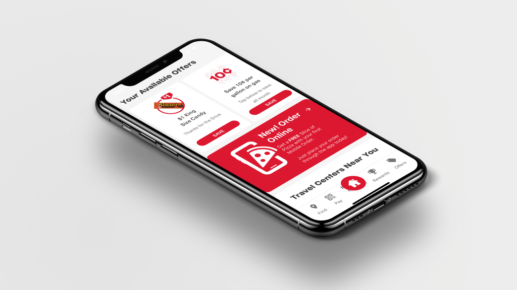
“launched mobile ordering with welcome offer generating 2.2K+ mobile transactions within 2 weeks of go-live”
Business Goal
Transform Pilot from being primarily known as a fuel stop into a reliable, convenient food destination by launching Mobile Ordering & Order Ahead directly in the Pilot app. The initiative aimed to:
- Establish brand awareness on the platform, engaging customers while establishing first-time transactions and becoming loyalty members.Grow food & beverage sales through first-party digital channels
- Improve convenience and order accuracy for guests on the road
- Reduce dependency on third-party delivery commissions while still leveraging marketplace reach
- Create repeatable, scalable store workflows for consistent guest experience across locations
Background
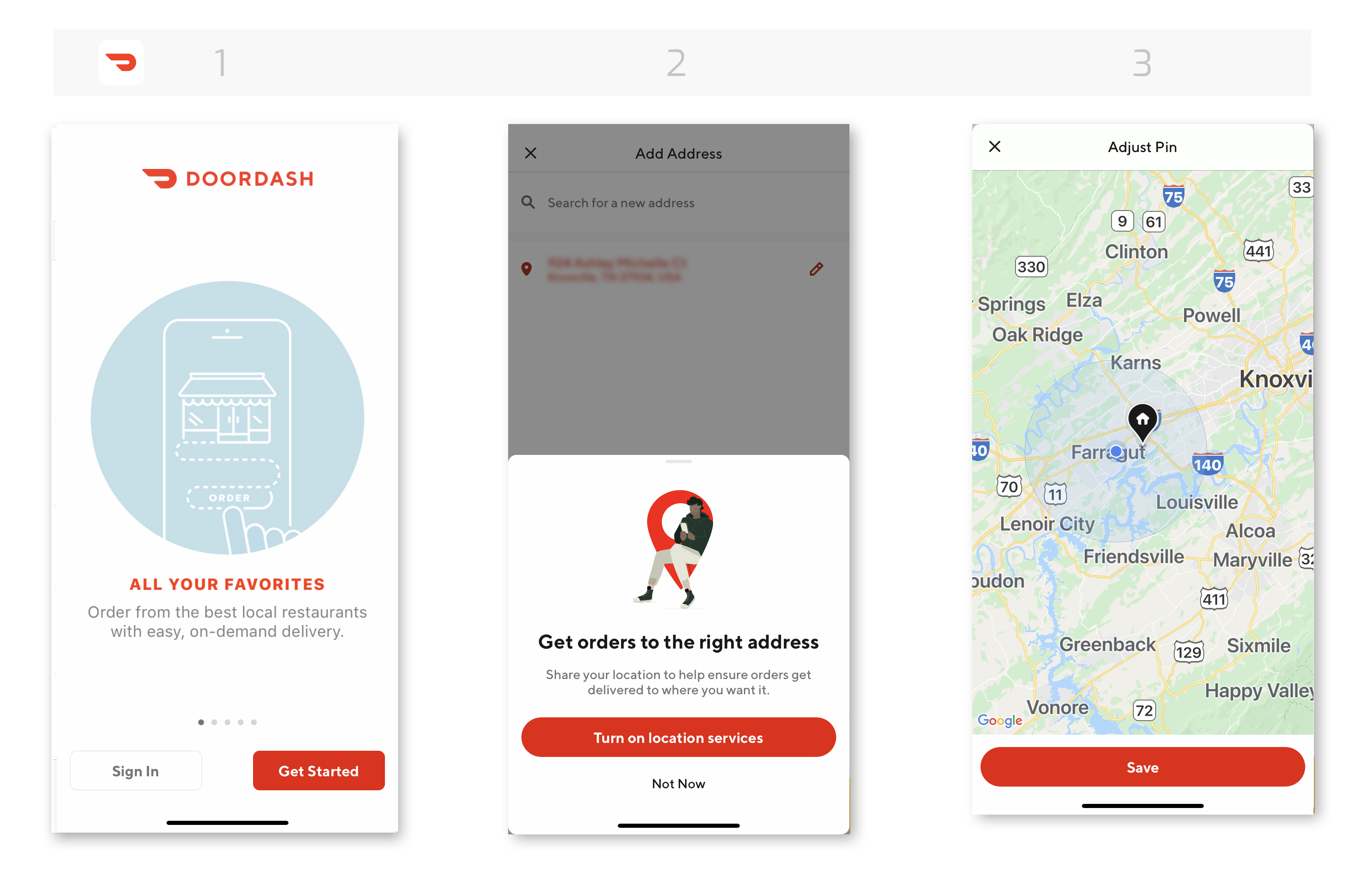
Pilot’s early digital success came through third-party delivery platforms (DoorDash, Uber Eats, Grubhub). These partnerships helped build foundational practices around:
- Menu & modifier structuring
- Bagging and labeling workflows
- Basic staging / pick-up coordination
However, first-party Mobile Ordering introduced new requirements:. Guests, not delivery drivers, would be picking up orders.
This shift required:
- Creating brand awareness in-store that coincides with app experience
- Clear pickup signage and location flow
- Standardized bagging and condiment workflows
- Defined refund and exception handling
- Training & adoption support for store teams
Additionally, menu expansion beyond pizza into hot deli, grab-and-go, wings/tenders, and cold case offerings increased order complexity — making operational consistency essential.
Role
Business Stakeholder & Digital Product Management, I connected Product + UX Design + Store Operations + Support + Consumer Insights to ensure the mobile ordering consumer experience worked both digitally and operationally.
My goal: create a seamless and reliable end-to-end experience, from the digital interface to the final pickup.
Core responsibilities:
- Engage and retain customers
- Authored the business case and rollout strategy
- Translated store workflows into product requirements
- Established bagging, condiment, labeling & staging standards
- Built cross-team alignment frameworks for execution consistency
- Created and maintained the Guest Feedback, insight, and fix loop
Project required working closely with:
- Marketing
- Product & UX Design
- Product & Engineering
- Operations Excellence & Field Teams
- Food & Beverage Leadership
- Customer Support
- Consumer Insights
- Guest Services
Business Insight
We were already running third-party delivery through DoorDash, Uber Eats, and Grubhub — which gave us mental models to work with.
Delivery surfaced operational patterns:
- Missing condiments which caused instant guest frustration
- Bagging process was not effecient which slows pickup
- If pickup isn’t signed clearly guests feel lost
- Refund handling must be consistent to maintain trust
- Drive website and app traffic, build brand awareness
Instead of starting from scratch, we built Mobile Ordering on top of what worked — and improved what didn’t.
Mobile Ordering wasn’t meant to replace delivery — it complemented it:
- Delivery drives reach.
- Mobile Ordering drives loyalty, margin, and repeat behavior.
Customer Experience
Established a welcome offer experience that converts intent into action by rewarding users at the exact moment of sign-up.
Problem’
Traffic does not convert users not loyal members. Guests lacked an immediate, tangible reason to create an account. Adoption of the app was also a concern as guests are introduced to new behaviors.
Strategy
New users are promoted to download the app and join the loyalty program to unlock a free slice of pizza, the offer saves to their account once the account is created, and is redeemable before checkout.
Customer Engagement
Bring a clear value proposition t entry points, making sure several entry points are accessible. This allows them to Join the program, save the offer, and redeem at checkout.
- Reward immediately when added to checkout to reduce friction
- Redemption at checkout reinforces behavior and perceived value.

Outcome
The flow transformed loyalty from passive concept into active, non- loyalty members into reward members, with a value driven experience. Converting anonymous traffic into registered users, increasing first-order transactions, establishing early habits that support long-term retention.
Third-Party vs Mobile Operations
Each platform has its own personality—different user habits, interfaces, and technology. We had to recognize those nuances and adjust our approach so the experience felt seamless no matter where guests ordered.
| Factor | Third-Party Delivery | Pilot Mobile Ordering | Operational Impact |
|---|---|---|---|
| Pickup | Drivers pick up | Guests pick up | Requires signage and clear handoff points |
| Business Value | Reach & new customer acquisition | Loyalty, repeat behavior, margin retention | Internal channel holds highest lifetime value |
| Data Ownership | Marketplace owns guest data | We own behavioral and order data | Enables personalization and offer strategy |
| Operational Focus | Bag for driver | Bag for guest presentation and clarity | Requires standardized pick and packing workflow |



Market & CX Research
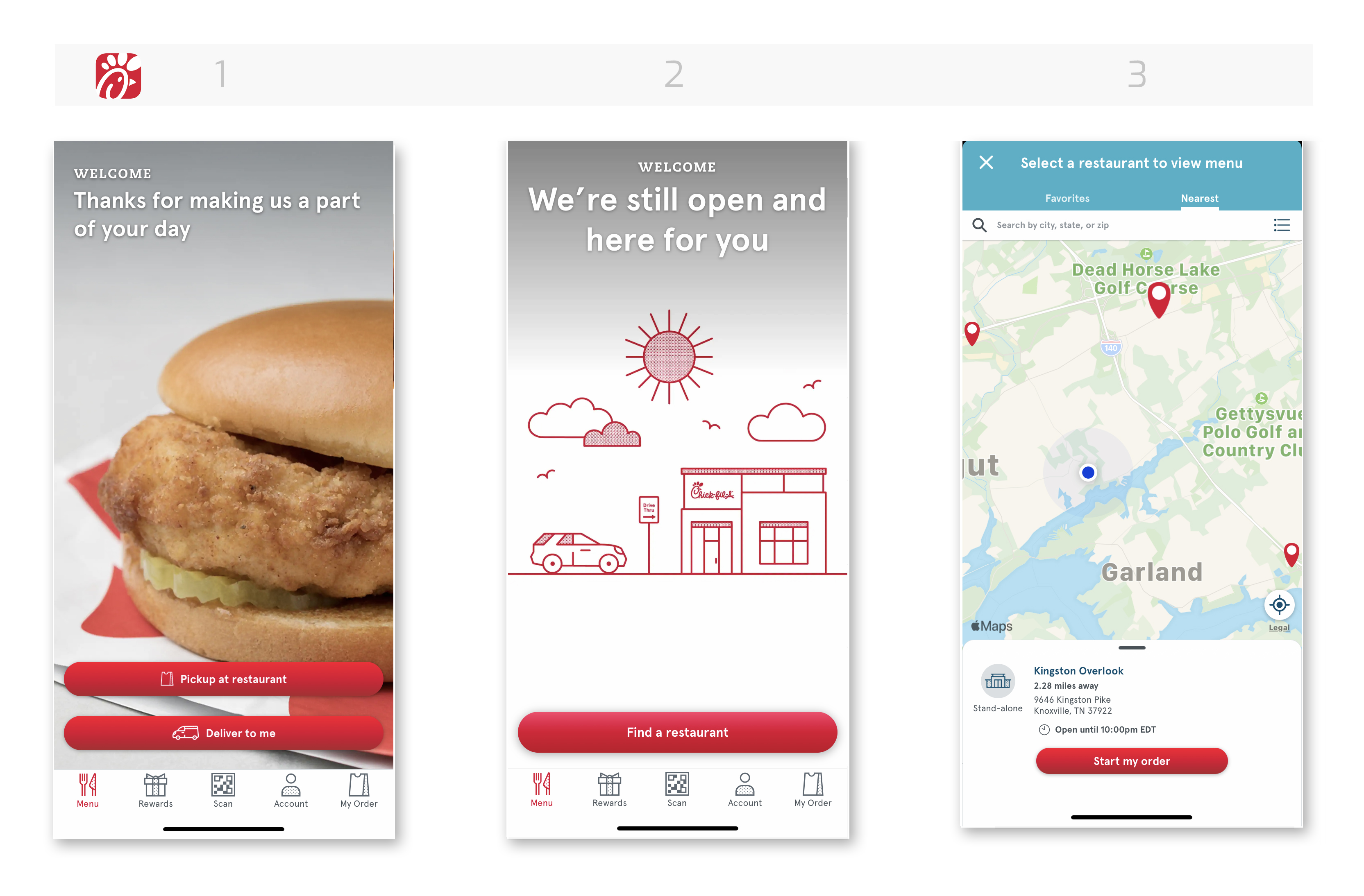
We looked at how other brands handle customization, pickup, and fulfillment. We grounded decisions utilizing mental models from our competitors:
| Brand | Learning | Applied Change at Pilot |
|---|---|---|
| CAVA | Ingredient customization is easier when modifiers are grouped | Grouped toppings and sauces in menu UI |
| Starbucks Pickup | Bag labeling + staging must be visible from entry path | Standardized label placement + pickup shelf visibility |
| First Watch To-Go | Condiments pre-bundled reduce accuracy issues | Built condiment kits prepped at shift start |
| Love’s Travel Stops | Lack of directional signage creates confusion | Designed pickup signage templates and location placement guidance |
We also performed observational store walk-throughs, time studies, and Food Business Partners ride-alongs to understand:
- Prep rhythm
- Team communication during peak hours
- Space constraints by store layout
- The “mental load” of bagging vs. serving walk-in guests
Insight: The product can only succeed if the workflow is fast, clear, and repeatable under pressure. Guests want food ordering to feel effortless and predictable.
Operational Enhancements
Created fulfillment standards to reduce complexitity and elevate the guest experience. The enhancement had business and guest impact. These standards create ease of operation for the team members and elevated experiences for the guest.
Condiment Standards
Guests care about condiments more than we think. Missing condiments = instant frustration.
Solution
- Created a condiment pairing matrix for every menu item
- Introduced pre-built condiment kits for simpler pack-out
- Added visual prompts at the assembly station
This alone reduced refund requests tied to “missing item.”
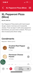
Example of condiment offerings:
- Packets: Ketchup, Mustard, Mayo
- Dips: Ranch, BBQ, Honey Mustard, Blue Cheese
Example of condiment by category:
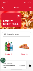
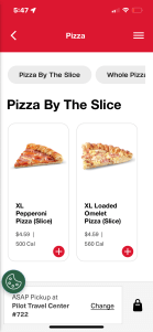
- Whole and Sliced Pizza: Crushed red pepper, Parmesan cheese
- Chicken: All packets and dips
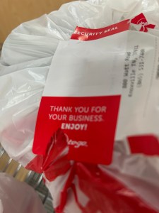
Bagging & Label-First Workflow
Before mobile ordering, every store bagged differently — which meant guests sometimes couldn’t tell which order was theirs.
Solution
- Standardized bag size
- Implemented a label-first workflow
- Created visual pack-out diagrams (especially for hot + cold orders together)
This improved speed, consistency, and guest confidence at pickup.


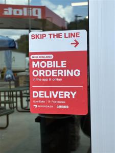
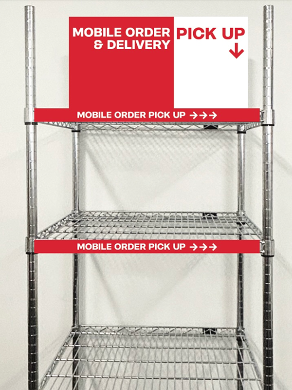
Pickup Zone Signage
Pickup only works when you know where to go.
We designed clear signage and recommended placement by store layout, so guests never have to ask.
This reduced counter congestion and supported staff during peak hours.

| Area | Change Implemented | Result |
|---|---|---|
| Condiments | Created condiment pairing standards and ready-to-grab kits | Reduced missing item complaints & improved guest satisfaction |
| Bagging Workflow | Standardized mobile ordering pick and packing procedures | Faster fulfillment and clearer pickup identification |
| Pickup Staging & Signage | Rack and signage placement based on store format | Reduced “Where do I go?” questions & counter congestion |
Refunds & Guest Feedback Loop
Created a structured feedback loop with prioritization and a follow up system to field ops team and product teams for improvement.
- Inputs: Support tickets, app feedback, field manager reports, refund data
- Analysis: Identify patterns (e.g., condiments missing at open, pickup signage creates low visibility)
- Action: Deliver workflow and UX + communication updates
- Validation: Field test → rollout → reassess
This allowed Mobile Ordering to improve after launch, and not become stagnate.
Solution
- A repeatable system to convert guest and field feedback into product and operational improvements.
Inputs Used
- Guest support tickets
- App and store signage usability feedback
- Food Business Partners surveys
- Menu performance and refund analytics trends
Outputs Produced
- Menu configuration simplifications
- Condiment pair defaults added to packs
- Pickup signage moved to higher visibility zones
- UX naming and layout improvements
Outcome
- Continuous improvement driven by real behavior, not assumptions.
Business & Guest Impact
With operational enhancements, a refund process in place and a feedback loop implemented.
- Condiment Standards: Fewer remake requests, improved completeness
- Bagging Workflow: Faster fulfillment and easier guest identification
- Pickup Staging & Signage: Reduced confusion and counter congestion
- Refund & Support Flow: Faster resolution and higher trust
Workflows became consistent across stores which lowered stress for travelers & pro drivers. Reduced refund and remake costs which increased confidence the order will be right. Strengthened brand perception as a food destination which encouraged repeat ordering behavior.
Takeaways
Even though the deadline was tight, we followed a mental model based on other popular apps‘ patterns.
Digital success only happens when store workflows support the promise. Third-party delivery was our operational test bed — we matured from there. Small details (condiments, labeling, signage) drive large experience outcomes.
With business and operational knowledge, I was to integrate business goals and UX design with real-world execution.
| Learned from Third-Party Delivery | How it Applied to Pilot Mobile Ordering |
|---|---|
| Drivers need fast, clear pickup zones | Guests need clear pickup zone signage & staging areas |
| Delivery errors often stem from missing condiments | Created condiment pairing Standards + pre-built condiment kits |
| Bagging inconsistencies slow handoff | Implemented label-first bagging workflow to increase speed & identity clarity |
| Refund friction reduces trust & costs money | Built refund & recovery playbook with scenario-based paths |

