launched new loyalty portal with exclusive offers for 750+ retail locations, reward management and point redemptions
Business Goal
Allow loyalty members to view their reward status and redeem points on a responsive website. Rebrand and design a new loyalty member portal with additional functionality, acting as a central repostitoy for all membership needs.
Background
Point of sales (POS) relies heavily on satisfying their guest purchases and monthly rewards. A loyalty program has monetary value and represents the overall brand.
An existing portal website exits containing point of sales (POS) transactions and card management, but where are the rewards?
A vital component of a loyalty program is the reward redemption and the management of those rewards. The project is a milestone for the company and depends on its success for the loyalty program to evolve.
Currently, the reward program only exists on the mobile app with limitations with an older design. Based on the app’s current state, the user experience needs improvement, and members need a central location for managing their rewards, transactions, and card management.
Role
Lead designer: UX/UI focused on information architecture, visual design and interaction design. Main focus was on responsive design for the rewards website to add cohesivness.
Project required working closely with:
- Product Owner
- Loyalty Rewards Team
- Merchandise Team
- Sales Team
- Marketing Team
- API Developers
- Front End Developers
Design Insight
Being that there was an existing reward program on the mobile app, an analysis of what currently exists and how it reacts to screen breakpoints was necessary.
A collaborative effort with Ad Sales, Marketing, Merchandise, and API Devs ensured branding stayed compliant with the current mobile app effort.
Syncing groups regarding labeling products, images, metadata, and copy restrictions were vital for the marketing campaign.
Design Concept
With an existing reward program on the mobile app, an analysis of what currently exists and how it reacts to screen breakpoints was necessary.
A collaborative effort with Ad Sales, Marketing, Merchandise, and API Devs ensured branding stayed compliant with the current mobile app effort.
alignment regarding product labeling, images, metadata, and copy restrictions were vital for optimization
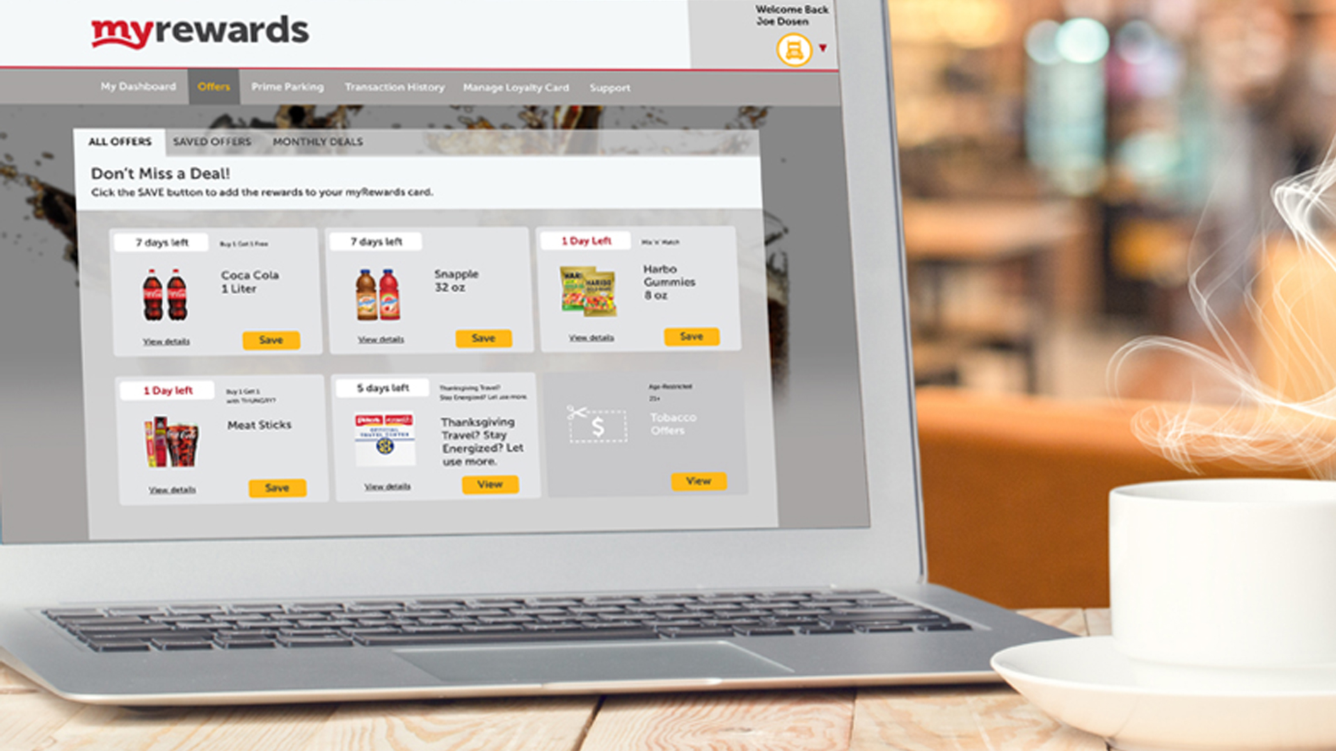
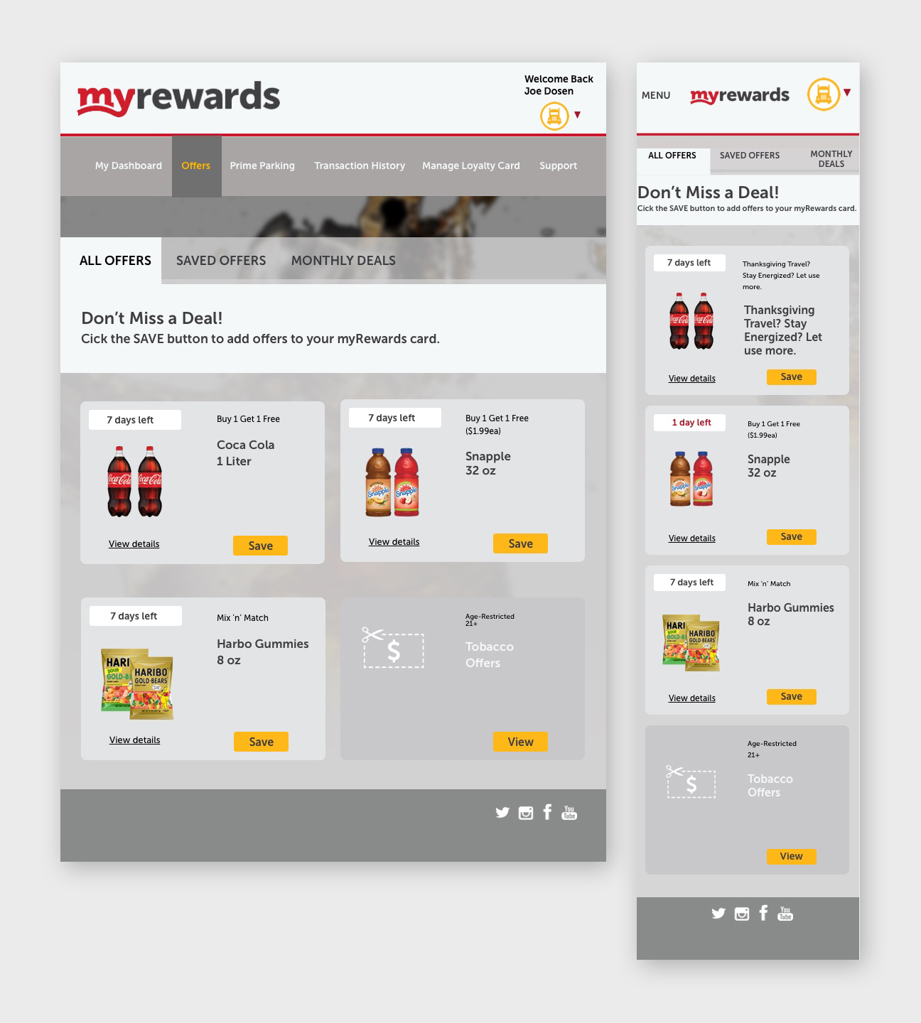
The new concept of managing offers dynamically was met through responsive design and consistency among the interaction.
Alerts produced on tabs signified additional action to be taken by the end-user, which helps guide users journey.
The workflow is smooth and encourages continuous action amongst the user, guiding them through the interface.

Mental Models
Creating new mental models for a product requires standing out from the competition and satisfying business needs. Building a prototype assesses how well it performs.
Does it satisfy customer needs? The design is a series of responsive web pages allowing guests to interact with store offers dynamically.
The goal is to incorporate a designated area for rewards and add a look and feel for the store offers’, which adds complexity to the design. All coincide with the mobile app, which derives from marketing and advertising efforts.


Takeaways
Processes on how offers were populated needed more venting, requiring research and education amongst the team.
Because there are so many offers, the challenge was to get them onto one page without clutter.
By creating a responsive design for the rewards website, the loyalty reward program will be utilized by guests to redeem points for specific rewards, drive more revenue, partnerships, and improve customer retention.
The developers’ specs were challenging because of the multilayered interface and multiple screen sizes, as well as working with outside vendors.
Prototype
Below is the user journey, a scenario that drives the business owners through the user’s interactions with the interface.
The prototype helps with buy-in, explaining design decisions, and introducing empathy from the user’s perspective.
The walkthrough is vague enough to determine if the interface is intuitive for the user. The instructions are short and to the point of reducing confusion.
Originally the prototype was created in Sketch/Invision, but then recreated in Figma. Experience the prototype click-through.

User Scenario:
A member has an alert for new offers in their loyalty app. They want to explore offers, and when they find one, they want to save it for later use. They want to double check to make sure the offer is saved in the app.
Tasks:
- Member views Offer Details
- Saves offer for later use
- Views offer in Saved
Offers - Goes back to All Offers
