The Business goal is to make two identical SAAS portals, one for the customer support for and one for the Loyalty sales team. Both implemented at the same time.
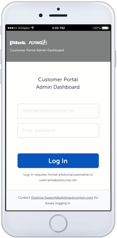
The desire is to keep the two admin login screens the same for both portals. Having the design be the same will help with adaptability from the internal sales team.
Background
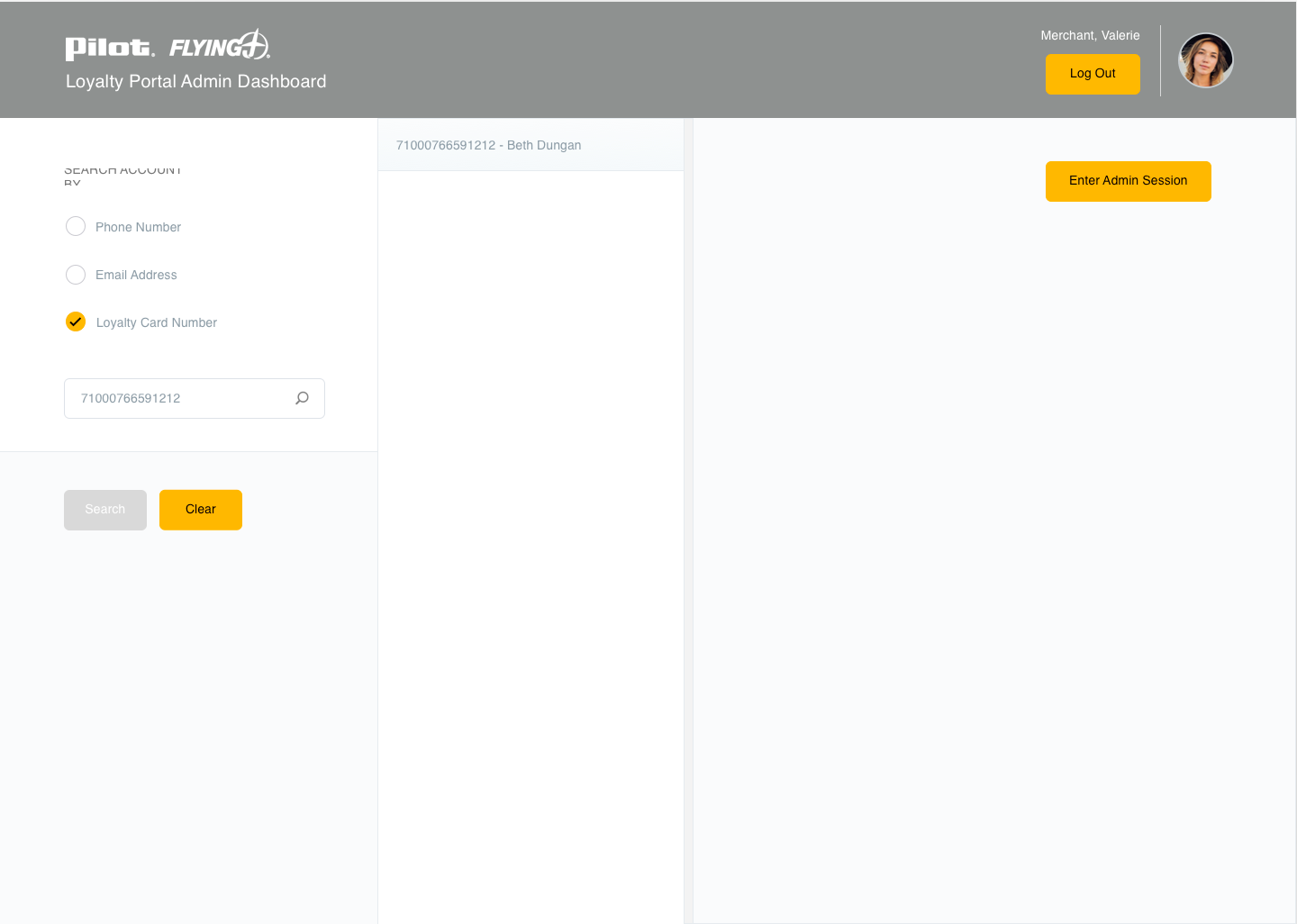
A customer portal is desired for impersonation of the customers’ screen while the sales team discusses issues with their Loyalty accounts. Currently, the customer and Loyalty portals do not exist, so this is a new concept for the business.
Role
UX/UI focused on information architecture, visual and interaction design. The need to find a balance between the API team, developers and insight into how the internal sales team operates is crucial.
The project required working closely with:
Product Owner
Project Manager
Business Analyst
Sales Team
The steps by which the user (sales representative) takes is vital because of the APIs identified through Salesforce, thus determining what information displays and how much, how the data is retrieved impacts the interaction design decisions and expectations from the end-user.
Discovery & Insights
The portal is responsive and needs to be clearly understood by internal sales representatives and companies.
The project requires several API notifications in response to user interactions and communication for the workflow.
Design Intent
Because this is something entirely new for the organization, the mockups represent all the scenarios based on the business owners and business analyst requirements.
Knowing that there may be steps added or missed, making rapid iterations of the design was crucial; this way, a proposed idea was always in front of the internal sales team to review.
Because the impersonation screen is yellow, part of the brand’s color, we decided to make the customer portal blue different from the end-user.
This approach eliminates confusion when the salespersons logged in as the business partner.
Workflows created in an interactive prototype made it much easier to find flaws in the design with buy-in from end-users.
Additional user testing is recommended in later iterations to learn if the UI works continue to work for the business.
Challenges
Due to the business not knowing exactly how Salesforce pulls information, it is challenging to understand how the content is structured and what error messages are needed by the API team.
The UI functionality is challenging to the API team and developers, and responsive design is challenging due to the amount of information required for selection during the impersonation process (including error handling).
Takeaway
The first round of iterations is a success, and continued feedback from the sales team allows for future UI enhancements, thus the roadmap.
Interaction with the Salesforce team workflow will continue to grow as UX methodology matures within the organization.
The customer portal enhances workplace productivity and helps the sales team support their business partners; on the desktop and mobile devices.
“launched enterprise digital wallet with a 93% success rate and 10% above average checkout, earning 260K+ within 30 days”
Business Goal
Create a common payment experience that spans the enterprise. Keep consistency across the organization by creating a baseline widget.
Background
The enterprise has many platforms, all with different payment checkout experiences. By reusing technology consumers are familiar with, the enterprise will save on implementation costs and increase delivery time. The technology used is Stripes payment functionality, and as a start, influences the design of payment methods across an enterprise.
Using Stripes foundation, along with Accessibility became challenging when working with cross-organization teams who design and develop their own applications. Mobile first was our focus, which also introduced roadblocks.
Role
Lead designer: UX/UI focused on payment mental modals and research methods, including brainstorming techniques, initial designs and task workflows.
Project required working closely with:
Capability Director
Product Owner
Stakeholders
Front End/Backend Developers
Enterprise Business Areas/Stakeholders
Stripe: Product/Developers
Solution: Product/Designers
Optum RX: Product/Designers/Developers
United Health Care: Product/Designers/Developers
Design Insight
Who are we designing a widget for? A consumer, who could be a patient, member, or customer service agent, needs a systematic way to add a payment method to accounts, which could span several applications. Familiarity and trust are vital when designing an experience with many sub-brands under one enterprise brand.
Inconsistent enterprise payment procedures.
The widget is a contained component, (Influenced first by Stripes baseline capabilities) encompassing several elements of adding a payment method.
The component as a whole acts as a digital wallet and allows users to edit, add a payment, save, delete, make default. It’s responsive and is configurable to meet merchant sites across the enterprise.
A competitive analysis was done with several sites who use health related payment methods such as HSA, FSA, and medicare cards. Some of these competitors where Amazon, Walmart, and Target.
We also looked at financial apps and how they approach digital wallets, as health accounts are also considered payment methods.
Targets digital wallet UI for desktop.PayPal digital wallet UI for desktop.
A Health Savings Account (HSA) card uses the same frontend UI as a Credit card, but to many consumers, they are two separate entries. The back end can be one in the same or different, depending on how the merchant handles the functionality.
We did not let “health accounts” drive the design; we looked broader at financial apps such as Paypal, a huge influencer, especially in the mobile app space. Its design utilizes both vertical and horizontal scrolling (which we found out later causes issues with accessibility).
Mobile first design helped drive the mental model of using a single container for multiple purposes. Oddly enough, both Stripe and PayPal have similarities as they both use common patterns in popular financial apps. All competitors we reviewed had familiarity with a digital wallet and its capabilities.
PayPal digital wallet UI for mobile app.
PayPal “Add to Wallet” UI for mobile app.
Design Challenge
The widget works as a standalone unit. The container is one- column intentionally, thinking mobile first. The widget can embed in a business application, and may only have a small space to live with many supporting components. How does a single container that is enterprise wide work in many different areas?
Spacing guide for digital wallet in widget experience.
Design Solution
The solution to making one size fits is having the one-column container responsive. It can work in a mobile app and a responsive website as an embedded component or pop-up. A hosted experience allows the container to present itself in an overlayed browser window.
The varied usage of the container gives the merchant sites flexibility while using the same capabilities. Parts of the widget and the screens can be customizable with text, color, and styling.
One-column design’s flexibility for widget scaling in diverse environments.Baseline theming guide for widget component branding.Widget customization guide for diverse business areas. Solutran’s payment widget integration.
User Flows
There were discussions focused on integrating the payment method editing feature into other business interfaces, which sparked controversy.
The current one-column design, which includes all tasks, caused issues for applications with a separate flow for editing the payment method. These issues also raised concerns about accessibility.
User flow for edit payment method.Wireframe flow for edit default payment method.
Accessibility Standards
The desktop has clear and defined standards for accessibility, but mobile apps are not as strict and have fewer standards.
After consideration of specific use cases, testing, and accessibility evaluation, the widget undergoes continuous change as it evolves and adapts to various enterprise use cases and accessibility evaluations.
Accessibility evaluation for form fields.
Mobile apps influenced the design because it’s a single-column, and many user tasks are contained within the container; therefore, accessibility arose when addressing solutions for desktop and mobile.
Issues arose when we embedded one-column widget within applications. As a standalone, accessibility is one thing; when embedded in an interface with other components, it adds complexity.
Accessibility Challenge
Issue found was the vertical menu used to edit the payment types. The vertical menu pattern is found on many popular apps, but accessibility is not defined as well on mobile as it is on desktop.
The keyboard tabbing order was not clear when tested for accessibility. The radio button (used for selection) and the vertical menu (used to edit) are utilizing the same focus area. Because the standards for accessibility are higher than usual for health applications, we had to find another solution.
Accessibility Solution
For the next design iteration (phase), the kabab was removed, not only for accessibility but also for scalability of the widget. In order to pass the focus state for keyboard tabbing, we made the “Edit Payments” a separate page, which also includes the “Add Payment” button.
Creating an “Edit” flow another page removes accessibility complications: multiple items competing for tab focus; this approach also simplifies the digital wallet screen from a visual hierarchy perspective.
MVP version and new iteration: Digital wallet screen with removed edit menu.
Takeaways
When designing for a common capability across multiple applications, one thing is to remember responsive desktop and mobile app designs are different for a reason. Certain functionality is not present, depending on the device. Example: keyboard tabbing is not used on mobile devices but is on a desktop.
Accessibility standards are different for both platforms and are treated as such. Sometimes one size fits all has to be configurable to make it work, especially with enterprise business applications using different technology stacks.
launched new loyalty portal with exclusive offers for 750+ retail locations, reward management and point redemptions
Business Goal
Allow loyalty members to view their reward status and redeem points on a responsive website. Rebrand and design a new loyalty member portal with additional functionality, acting as a central repostitoy for all membership needs.
Background
Point of sales (POS) relies heavily on satisfying their guest purchases and monthly rewards. A loyalty program has monetary value and represents the overall brand.
An existing portal website exits containing point of sales (POS) transactions and card management, but where are the rewards?
A vital component of a loyalty program is the reward redemption and the management of those rewards. The project is a milestone for the company and depends on its success for the loyalty program to evolve.
Currently, the reward program only exists on the mobile app with limitations with an older design. Based on the app’s current state, the user experience needs improvement, and members need a central location for managing their rewards, transactions, and card management.
Role
Lead designer: UX/UI focused on information architecture, visual design and interaction design. Main focus was on responsive design for the rewards website to add cohesivness.
Project required working closely with:
Product Owner
Loyalty Rewards Team
Merchandise Team
Sales Team
Marketing Team
API Developers
Front End Developers
Design Insight
Being that there was an existing reward program on the mobile app, an analysis of what currently exists and how it reacts to screen breakpoints was necessary.
A collaborative effort with Ad Sales, Marketing, Merchandise, and API Devs ensured branding stayed compliant with the current mobile app effort.
Syncing groups regarding labeling products, images, metadata, and copy restrictions were vital for the marketing campaign.
Design Concept
With an existing reward program on the mobile app, an analysis of what currently exists and how it reacts to screen breakpoints was necessary.
A collaborative effort with Ad Sales, Marketing, Merchandise, and API Devs ensured branding stayed compliant with the current mobile app effort.
alignment regarding product labeling, images, metadata, and copy restrictions were vital for optimization
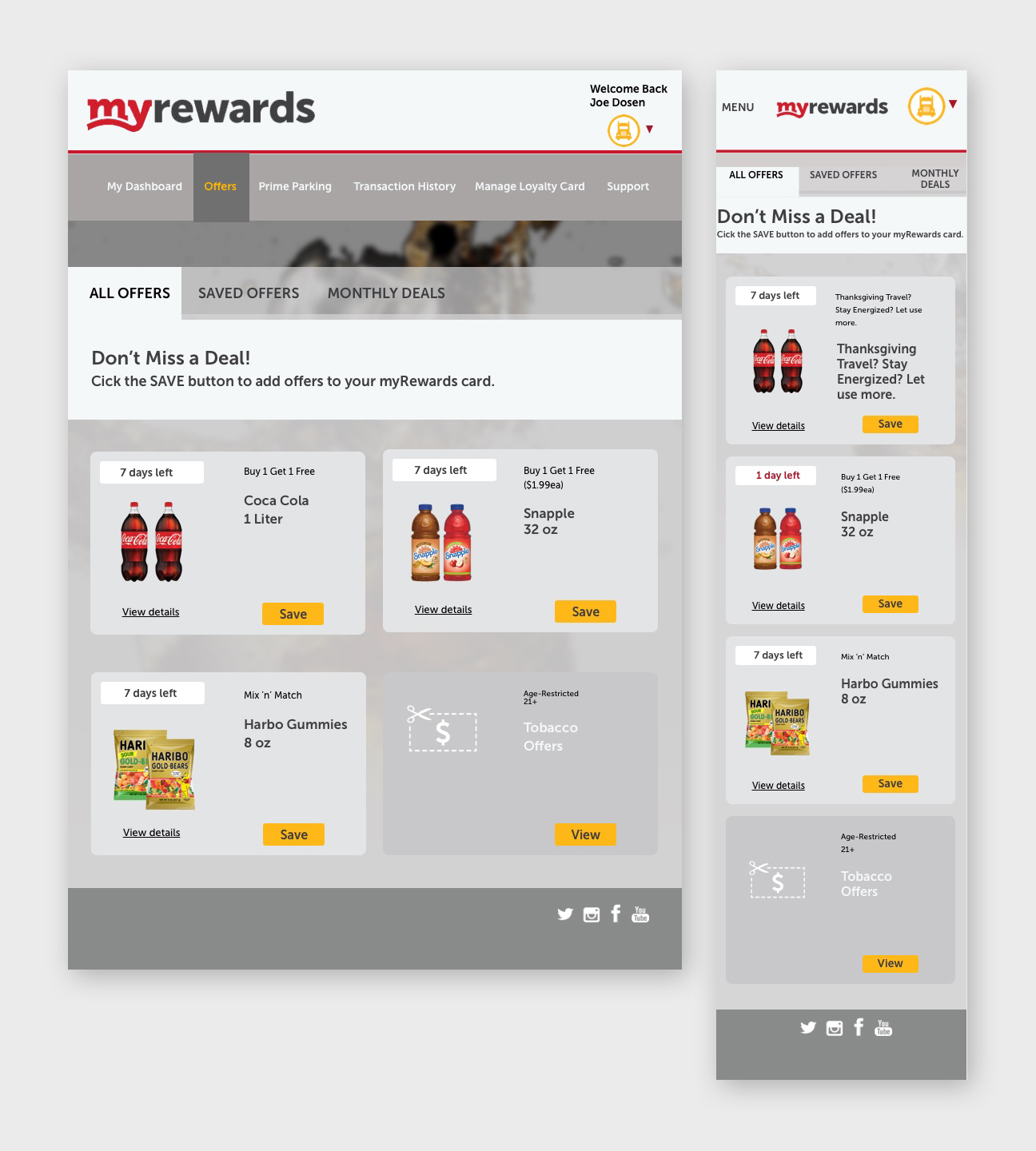
The new concept of managing offers dynamically was met through responsive design and consistency among the interaction.
Alerts produced on tabs signified additional action to be taken by the end-user, which helps guide users journey.
The workflow is smooth and encourages continuous action amongst the user, guiding them through the interface.
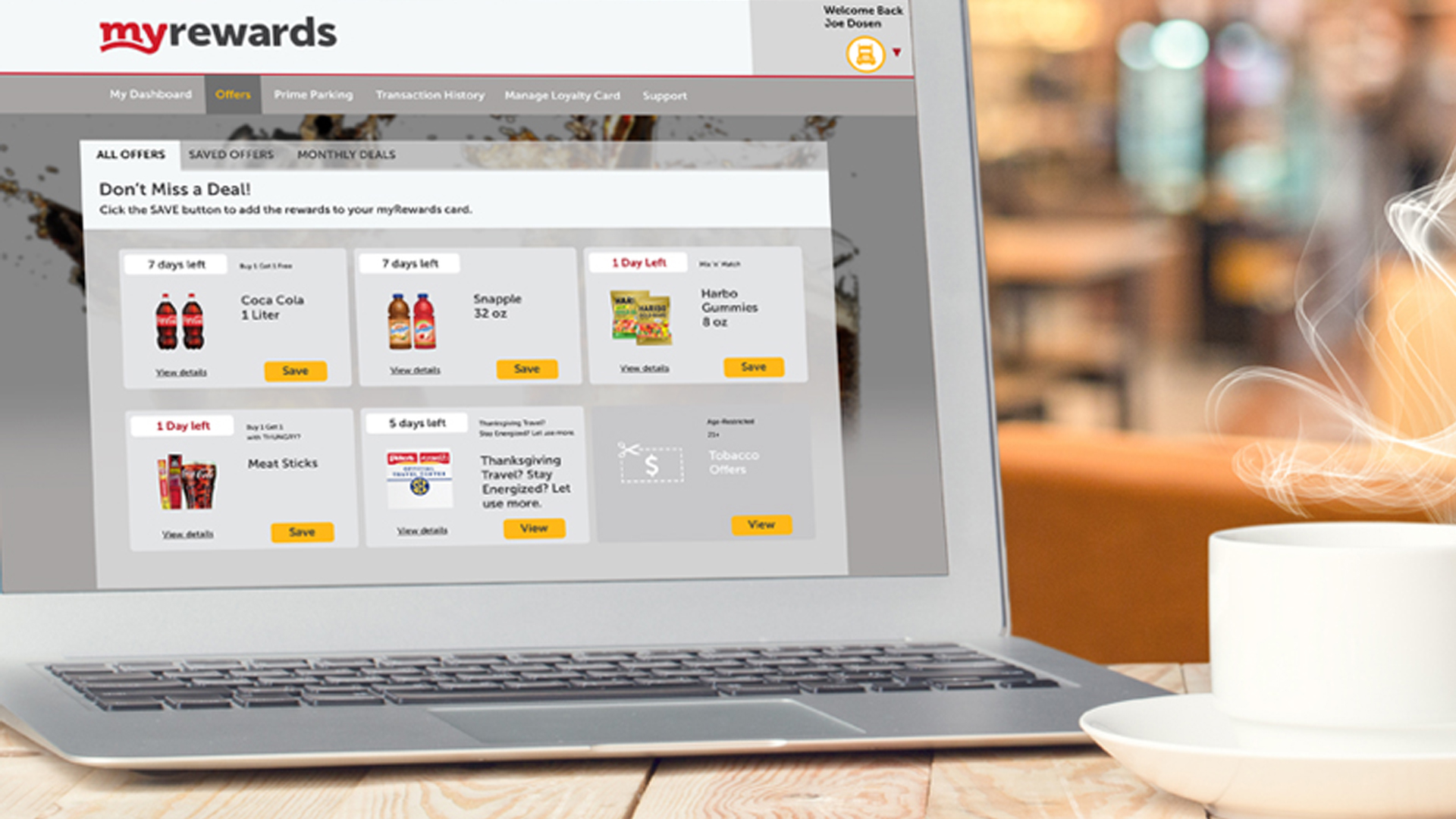
Current state: Mobile app – myRewards.
Mental Models
Creating new mental models for a product requires standing out from the competition and satisfying business needs. Building a prototype assesses how well it performs.
Does it satisfy customer needs? The design is a series of responsive web pages allowing guests to interact with store offers dynamically.
The goal is to incorporate a designated area for rewards and add a look and feel for the store offers’, which adds complexity to the design. All coincide with the mobile app, which derives from marketing and advertising efforts.
Processes on how offers were populated needed more venting, requiring research and education amongst the team.
Because there are so many offers, the challenge was to get them onto one page without clutter.
By creating a responsive design for the rewards website, the loyalty reward program will be utilized by guests to redeem points for specific rewards, drive more revenue, partnerships, and improve customer retention.
The developers’ specs were challenging because of the multilayered interface and multiple screen sizes, as well as working with outside vendors.
Prototype
Below is the user journey, a scenario that drives the business owners through the user’s interactions with the interface.
The prototype helps with buy-in, explaining design decisions, and introducing empathy from the user’s perspective.
The walkthrough is vague enough to determine if the interface is intuitive for the user. The instructions are short and to the point of reducing confusion.
Originally the prototype was created in Sketch/Invision, but then recreated in Figma. Experience the prototype click-through.
A member has an alert for new offers in their loyalty app. They want to explore offers, and when they find one, they want to save it for later use. They want to double check to make sure the offer is saved in the app.


 Kristi Harper