Category: Mobile UX Experience Design

  • 02: In-App Subscription Workflow

    02: In-App Subscription Workflow

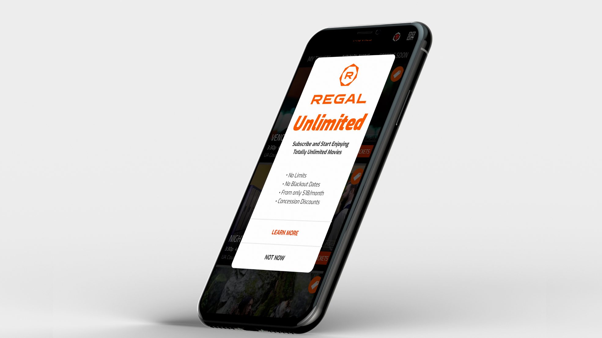
    “launched mobile in-app subscriptions, generating 80K+ sign-ups within 30 days, surpassing competitors”

    Business Goal

    Create a workflow in the mobile app for a movie subscription. Allow new and existing loyalty reward members to signup and then book tickets in a sequential order that is easy to use.

    Background

    The subscription based plan existed, but was only available for registration at the box office or over the phone with customer support

    Having the signup process integrated with booking tickets will increase ticket sales, loyalty memberships, movie subscriptions, and encourage app downloads.

    My Role

    Lead designer: UX/UI focused on various design and research methods, including brainstorming techniques, feedback from surveys, user testing, iterative designs, and workflows.

    Project required working closely with:

    • Business Analyst
    • Product Owner
    • Marketing
    • Stakeholders
    • Developers (iOS and android teams)

    Design Insight

    The understanding of the current state of an application and its current behaviors and workflows is key before doing anything else. An audit of the app’s current workflows, as well as screen grabs of the current state in both mobile platforms, was documented for use of journey mapping.

    This activity helped the team understand what we currently have and what we have to work with. It may be that an ask in the MVP can not be completed because of the additional development work of technology not currently in the app.

    Android: current state
    Android: current state audit

    Journey Mapping

    Another exploration was to document the workflow for booking a ticket since this activity was a key performance indicator (KPI) for the business. It also helps understand any current pain points within the app. This journey includes booking a ticket and signing into their loyalty rewards account.

    Challenge: the new subscription flow will integrate into the scenario below, which includes signing for the rewards program, as well as an existing member login. The business rule is that a user needs to be a loyalty member before signing up for the subscription plan.

    Scenario: John opted in to his Regal app for the first time on his phone, he wants to find a movie and look tickets. John is not a RCC loyalty member, nor does he have a Regal account.

    Booking a ticket - Journey Map
    Booking a ticket: User journey Map

    Competitive Analysis

    AMC, Cinemark, and Atom are among the competitors for subscription services.

    Each competitor offered an on-boarding workflow with multiple screens.

    Our goal was to guide as needed throughout the workflow, eliminating several introductory screens all at once.

    Consider cognitive load; if guides present themselves when the task is at hand, it becomes useful to the user than at the beginning of the journey.

    Competitor Analysis: on-boarding screens
    Competitor Analysis: on-boarding screens
    Loyalty and subscription programs: Regal, AMC, Cinemark
    Competitor Analysis: loyalty and subscriptions

    Mapping Competitors Emotions

    AMC’s workflow is smooth but seems like a lot of steps. It’s smooth because the steps drop-down; therefore, we feel like there are fewer steps. But the information visually feels heavy in weight.

    After having reviewed the workflow and capturing the current state, comments noted to the side dictate emotions towards the experience.

    AMC Workflow Audit
    AMC Subscription Workflow Audit
    Subscription screen workflow: AMC
    Screens focus on Onboarding, Location Preferences, and Privacy Acknowledgments

    Pain point: AMC introduces an upgrade early in the workflow, which causes friction for onboarding as the user is currently on a free account.

    Conditional Workflows

    Before requirements are flushed out, a rough workflow and conditional behaviors are mapped out based on assumption.

    The workflow becomes a guide we use to understand better the users’ journey— each card below lists out content on each screen and actions the user can take.

    Task user flow: Sign Up or Sign In as a Regal Crown Club Member
    Task user flow: Sign Up or Sign In as a Regal Crown Club Member

    Designing for Scenarios

    Capturing different scenarios help with edge cases, system and app errors, and additional requirements missed.

    In the scenario below, the user has already signed up for unlimited and logged in. They complete the following tasks:

    • Login
    • Book a ticket
    • Redeem a ticket

    Once scenarios are defined, design can work on screens. It helps designers to provide a context of use, patterns, and conditional behaviors.

    Scenario 2: User is Unlimited member, but not logged in.

    Scenario 2:
User task flow: User is Unlimited member, but not logged in
    Scenario 2: User task flow: User is Unlimited member, but not logged in
    User task flow: entire sequence
    User task flow: entire sequence

    Usability Test Sessions

    We scheduled two sets of testing. Initially we proposed three, but leadership shortened the timeline due to MVP deadlines.

    Each day consisted of two participants, one in the morning and one after lunch—gift cards given to candidates showed appreciation for participating.

    “continuous iterations with in-between testing sessions helped quickly evolve the design”

    Each candidate is a Regal Crown Club Member (RCC). Data pulled from a Loyalty member list. The ages spanned from 18-60 years old.

    • Motivation – saving money because they loved to watch movies
    • Needs – transparency in how much money they are spending
    • Desires – to share the movie experience with their friends and family
    • Frustrations – input of information

    Recruiting and Testing

    Calling and recruiting RCC members; criteria varied by way users experience booking from:

    • Box office
    • Website
    • App

    One thing we heard over and over again during testing was transparency. That was the most important takeaway.

    Users want to know cost upfront first before they go to the trouble of signing up for something.

    Letting the users know the pricing and terms early, helped motivate them to complete the signup process.

    In. house usability testing: IPEVO camera
    In. house usability testing: IPEVO camera

    Mental Models

    Setting expectations and guiding users for a successful registration is our goal.

    Below are a few onboarding screens, which link off to further information early on in the workflow.

    Walking the user through the process using iterative steps is critical. Because it is a lot of information to enter, the incremental steps allow for chunking of information so the user will not feel overwhelmed.

    “keep the user engaged and motivated to by having short sequential tasks”

    Lo-fi wireframes
    Wireframe flow: Onboarding
    1st iteration of design
    1st iteration of design

    Field Observation

    Following the launch, we went to the theatre to watch moviegoers use the app. Unlimited subscribers can enter the show using the QR code on the back of their digital card.

    Observing users was terrific; the use of the unlimited card for discounts on concessions appeared seamless.

    By scanning the card, the purchase is faster, promotes special perks, makes the user feel good, and adds personalization to the experience.

    In-app subscription flow for Regal app.
    Unlimited digital card for in-app ticket scanning
    Field research: Observation of members using digital card for discounts at concessions

    Field research: Observation of members using digital card for discounts at concessions

    Takeaways

    In the beginning, requirements were long for MVP, but it could have broken down to allow for a faster design process.

    The biggest takeaways are the UX findings during the usability sessions. Transparency was the number one thing we heard. Transparency builds trust, which encourages users to continue the signup process.

  • 03: In-App Concessions Sales

    03: In-App Concessions Sales

    “launched contactless ordering in 190 select theaters for social distancing efforts, generating 22K+ mobile transactions on go-live weekend”

    Business Goal

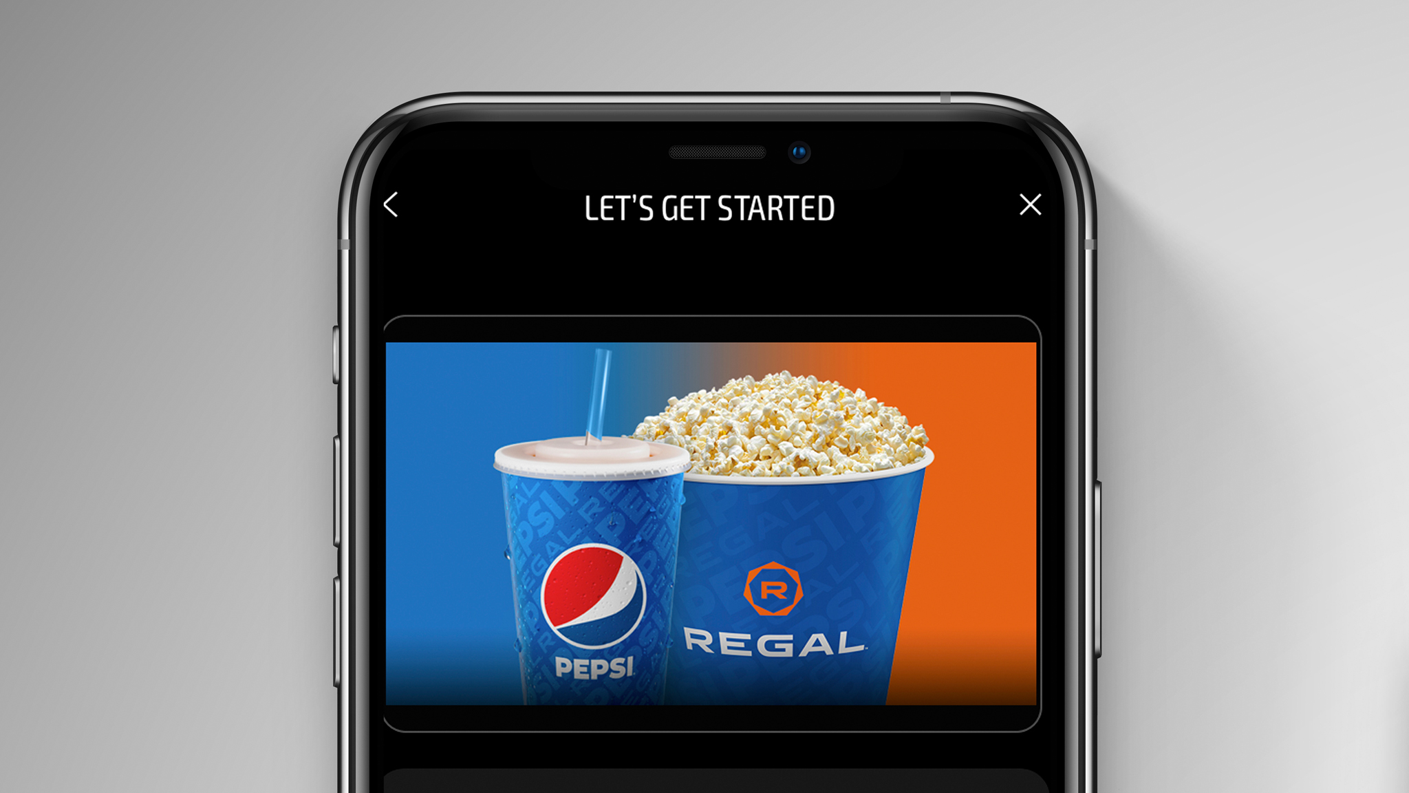
    Create a new feature to encourage moviegoers to order food and snacks within the app to reduce wait times at the concessions stands.

    The business goal was to implement contactless ordering, increase speed of service, and add convenience. The development team needed time to build and release before reopening theaters at the end of the summer.

    Background

    There is an MVP version, as well as a post MPV version. The feature is to be implemented on Cineworld’s mobile app and other tenants around the globe.

    Contactless ordering helps with social distancing and safety measures but will also encourage app downloads and in-app revenue.

    My Role

    Lead designer: UX/UI focus in various design and research methods, including brainstorming and problem solving techniques, competitive analysis, and iterative workflows within a testing environment.

    Project required working closely with:

    • Business Analyst
    • Product Owner
    • Marketing
    • API Developers
    • Front-End Developers
    • Food and Beverage
    • Operations

    Design

    Create a workflow in the app for contactless ordering of concessions.

    • Make a multi-step workflow intuitive
    • Avoid dropouts during signup

    Design Insight

    Within a week, the competitive analysis and a early concept influenced stakeholder buy-in.

    We could gauge stakeholder’s reaction to the design before creating a lo-fi prototype.

    The quick prototype allowed the business to view something tangible. A workflow to review for early feedback, and an opportunity to refine the ask.

    Onboarding

    DoorDash and Chick-fil-a are two apps that stood out when it came to onboarding in-app food ordering.

    Not everything about DoorDash aligned with our goals, but the onboarding part did match.

    The three screens below show:

    • Intro screen
    • Location services
    • Manage location
    Competitive Analysis: DoorDash On-boarding
    Competitive Analysis: DoorDash On-boarding

    Click-fil-a also has similar screens as DoorDash, but the intro screens differ slightly, being that Chick-fil-a is task-driven and DoorDash is informative.

    Both apps helped grasp the behavior and order of how the screen interact with one another and flow.

    The onboarding section is the first screens users interact with when entering the workflow. It sets the tone for the rest of the experience.

    Competitive Analysis: Onboarding - Chick-fil-a
    Competitive Analysis: Onboarding – Chick-fil-a

    Mental Models

    The menu levels and food tiers are essential because they define the hierarchy of the menu. Taxonomy is key.

    Due to resource constraints during the pandemic, the MVP menu did not include images for all menu items and concessions. Instead, the menu was prioritized based on popularity and inventory, with categories organized from broad to detailed for a streamlined user experience.

    McDonald’s and Chick-fil-a are two apps that stood out when it came to in-app food menus.

    Both apps aligned closely with the food menu structure for concessions. McDonald’s app has an easy to read the menu with defined categories.

    The quantity screen helps visualize what information needs to be present for the user to complete their order.

    Competitive Analysis:Menu Hierarchy - McDonald's Food Menu
    Competitive Analysis:Menu Hierarchy – McDonald’s Food Menu

    Chick-fil-a has a similar structure to McDonald’s. Both have what concessions is requiring:

    • Food categories
    • Single food category
    • Single item in the food category and quantity

    Notice both have customization on the quantity screen? You can add extra ice or give special instructions.

    Chick-fil-a has calories on its quantity screen, whereas McDonald’s has a menu to the nutrition values.

    These concepts are nice to have, but not all can be for MVP as the deadline is tight.

    Competitive Analysis: Food Menu Hierarchy - Chick-fil-a
    Competitive Analysis: Food Menu Hierarchy – Chick-fil-a

    Intentional Design

    The McDonald and Chick-fil-a food menus above influenced the outcome of the design for concessions. With minimal setup and no item images, we focused on taxonomy and data pulled from the food and beverage list.

    Managed by F&B, Operations, and API developers, this was a large collaborative effort to have the categories and item names appear a certain way that is user friendly.

    There was a lot of troubleshooting on the backend and character limits on the titles, approvals, and functionality. Time was not on our side, and inventory was limited per theatre location.

    Menu Hierarchy: Food categories

    Workflows and Behaviors

    The competitive analysis helped with understanding how to create a workflow even if it’s a rough draft.

    The workflow helps with issues early on. Viewing the customer journey from a big picture helps identify:

    • Missing scenarios
    • Current state
    • Current state reworked
    • New screens
    • Conditional behaviors
    • Messaging
    • Error messages
    • Edge cases

    Knowing the current state and future state helps with repurposing existing screens.

    The workflow helps with implementation and development and consistency with components.

    Feasibility: Workflow Expectations

    User Scenarios

    Scenarios use the paradigm and mental modal McDonalds and Chick-fil-a have; using a familiar pattern, the user will adapt more quickly.

    Wireframe sequence.

    Takeaways

    Even though the deadline was tight, we followed a mental model based on other popular apps‘ patterns.

    Knowing your current state helps implement a tight turnaround because you can reuse components and screens already created.

    In-app sales